![]()
All-Time Highs ? Yes, but ...
The beginning of summer is upon us and the last week of May had many financial media outlets buzzing with the news that the U.S. stock market was again hitting 'all-time high' levels. While that is certainly true of some market indexes, we thought it important to bring perspective to the current conditions as we enter the typically slower summer months of the calendar.
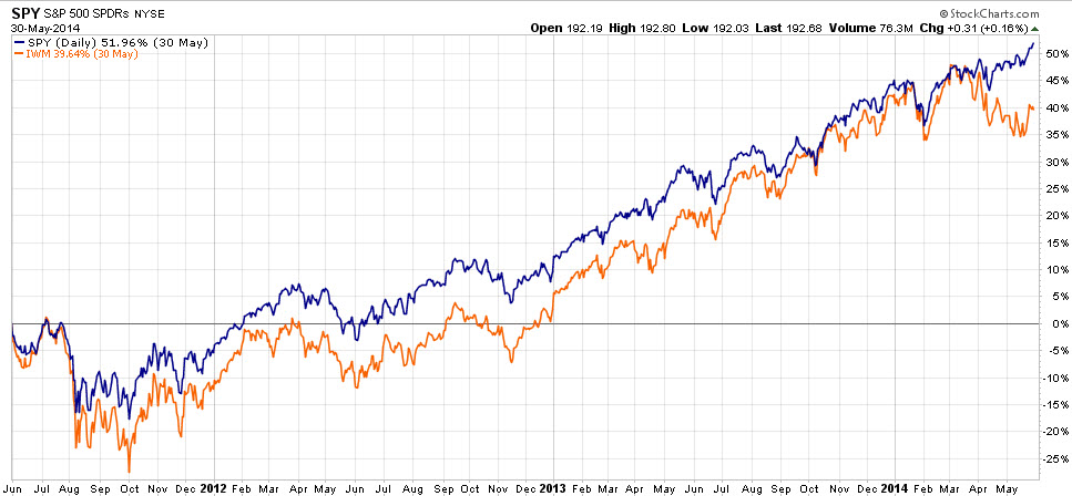
The S&P 500 stock index did actually make new high marks last week, putting that index at a +4.07% gain for the year 2014 so far. The NASDAQ index and the Dow Jones Industrial Average, however, have registered much quieter gains this year of +1.58% and +0.85%, respectively. Most importantly, the Russell 2000 index of smaller company stocks has actually had a negative return so far this year of -2.17%. This is something to watch closely because: 1) in a healthy market uptrend, all of the major market indexes tend to be moving upward together, and 2) small company stocks often lead the broader market at inflection points on both the upside and downside.
You can see the recent divergence in large company and small company stocks in the first chart shown. The blue line show the 3 year price history of the S&P 500, and the orange line shows the Russell 2000. Clearly those two lines have been tracking each other's patterns right up until April of this year (top right corner), and then the large company stocks continued upward while the small company stocks sold off. This divergence does not mean very much yet, but the relationship between these two will be very interesting to watch over the remainder of this year.
The important point here is that even though new high water marks have made the headlines, there have been a lot of cross currents going on underneath the surface. And after an exceptional year in 2013, the mildly positive start we are having to this year with our globally diversified client portfolios is more than reasonable and should be viewed as a very positive continuation of last year's gains.
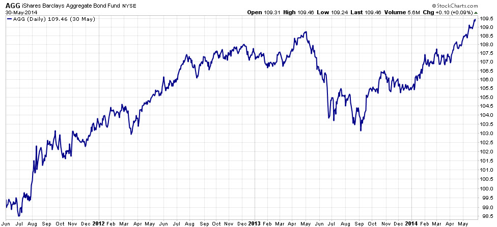
One of the other very interesting charts at this time is that of the overall U.S. bond market, represented by the Barclay's Aggregate Bond Index. In the second chart shown, you can see that this index also made new high marks recently, which is nothing less than stunning since many in the investment community called for the death of the bond market in the summer of 2013. In fact, the broad bond index is up +3.04% so far this year, and some segments of the bond market are up +4% and more for the year, giving many bond indexes better gains this year than most stock market indexes. Again, these categories will be very interesting to watch for the remainder of the year to see where they go from here.
Regardless of what the next several months brings, our firm and its sub-advisors will continue to monitor our allocations and make adjustments as conditions warrant. Please enjoy your summer and we'll be back in touch again soon!
Need some advice?
We're here to help. Get in touch with us and we'll do our best to guide you in the right direction.