![]()
Bond Fund Investors Timing Results
An interesting chart showed up in our research this week that we wanted to share with you. The first graphic below shows the net amount of money flowing into and out of stock funds (on the left) and bond and income oriented funds (on the right) The red circles in the bottom right corner show first a trend over many months of investors adding significant money to bond funds. Then, the interest rate spikes of this past summer spooked investors enough to reverse that flow and cause them to withdraw huge amounts from those same funds, especially in June, August and September.
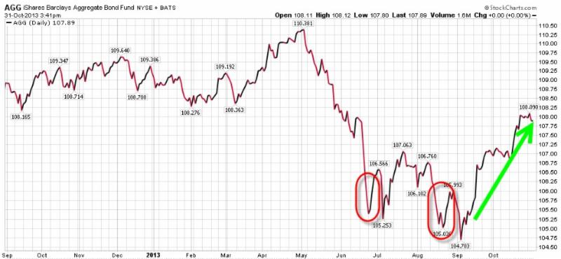
The second graphic below shows the Barclays Aggregate Bond Fund ETF performance over the same time frame, as this fund is considered a reasonable proxy for the overall bond market. The red circles on this chart show how the price was bottoming exactly when investors were selling these types of funds, and then the green arrow shows what happened to the price once the panic selling was over.
Time will tell how the bond markets perform in the future, but over this one year period, these two charts together show how powerful scary headlines and a herd mentality can be in the investment arena. They also show that in times of unusually strong market movements (in either direction), it is almost always best to stay calm and step back to evaluate opportunities from a bigger picture perspective. These are lessons that repeat themselves over and over again among a wide range of investment asset classes.
We hope you find this as interesting as we did!
Click on the below images to see the larger versions:

Need some advice?
We're here to help. Get in touch with us and we'll do our best to guide you in the right direction.